Warren for America

Together We Will
Whelp, that didn’t pan out. I really thought she had a chance. I loved everything about Warren and her campaign to win the White House, with the exception of, well, her campaign. Her branding needed a bit of a kick in the butt, and seeing as I love a project, I decided to concept a new look for her. I was hopeful she’d make it past the primaries and would be looking for some sharp new duds in time for the general election. Alas. Perhaps her office should have called me back. I mean, together we could have…
Involvement: Not enough, apparently.Branding
Logomark

Political campaigns love the American Flag. And for good reason. How, then, do you take a cliché and turn it to your advantage? The logomark is kept very simple, evoking the Stars and Stripes, while creating a high contrast W. It’s new and fresh, but also distinguished and grounded—just like Elizabeth Warren. And the whole shape evokes a forward and upward movement.
Wordmark

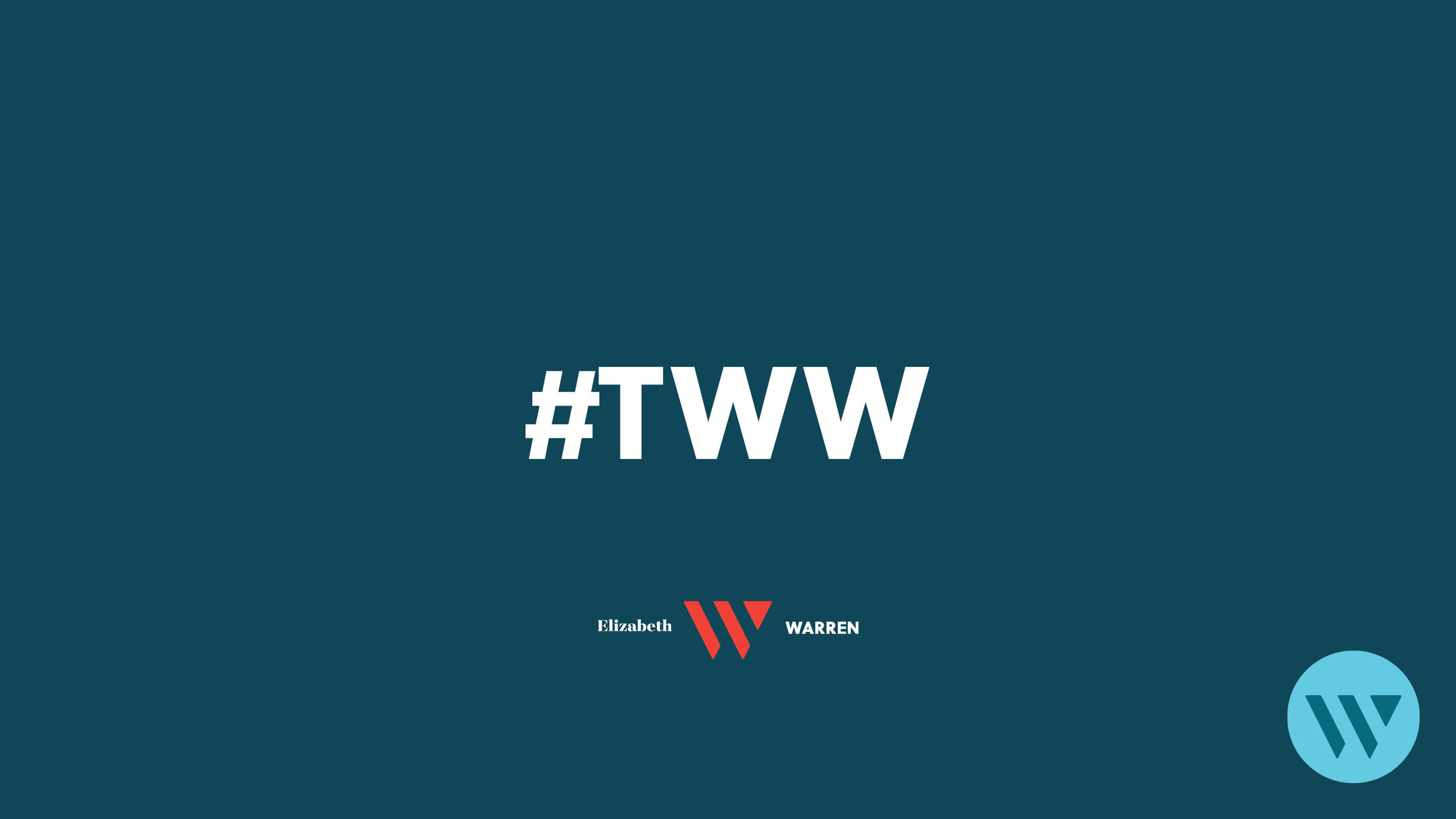
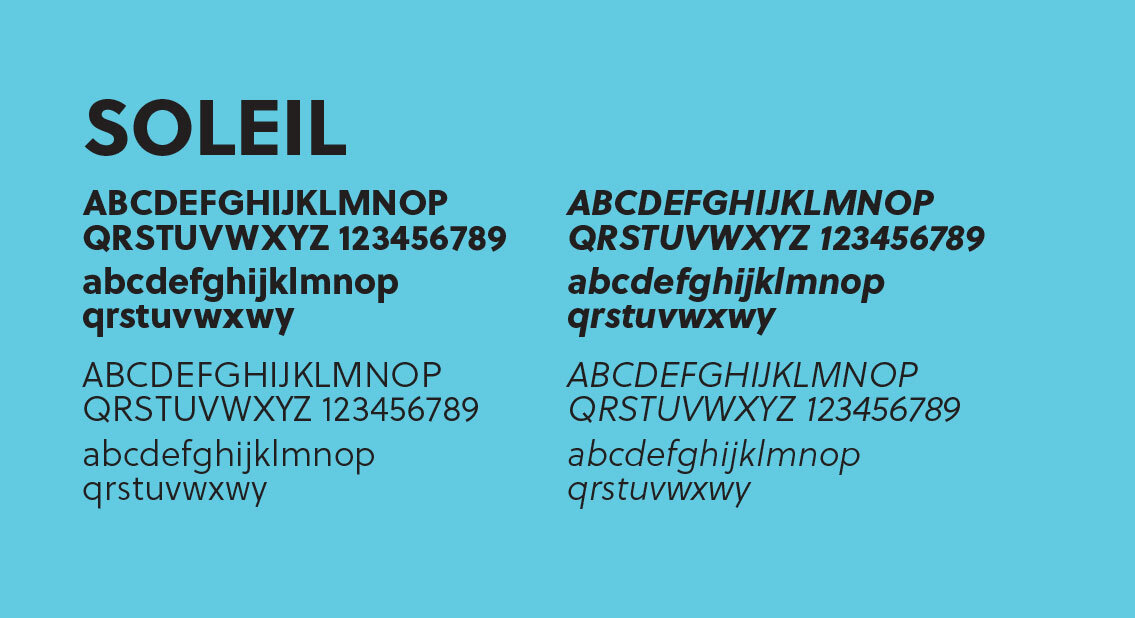
To further the contrast between classic and new, Elizabeth Warren’s logotype is broken into two typefaces—Majesti Banner for her first name, and Soleil for the last. Progressive campaigns have been employing modern sans serifs since Obama’s 2012 campaign, and the mix of a fashionable, high-contrast, serif typeface helps make Warren’s brand stand out from the pack.
The Line

The campaign is already focused around “We Will,” but including “Together” calls for an even stronger rallying cry and emphasizes the importance of unity at a time when our nation is suffering from its divisions. “Together” creates ownership which translates into a responsibility to act—to organize, to campaign, and, more importantly, to vote.
All Together Now…


Combining all the elements, we end up with a visually distinct, inclusive and memorable branding lockup. The “W” is in its primary red, white and blue form, and the name and the campaign line sit well balanced to the logomark’s right side. It’s modern, clean, progressive, while still being “electable.”
Typography

Colors

Are you tired of Red, White, and Blue? Hell no. That’d be un-American. But, we are definitely ready for a little a twist on a classic. The light blue is young and fresh (even fresher than Obama’s was), while the dark blue is classy like a night at the opera. A touch of pink livens up the red. And purple? I mean, if Elizabeth is going to win, she’ll have to have the biggest tent and welcome everyone who poked their head in, even folks who lean “red.” Purple is the meeting ground in the middle. Coming together in meaningful dialog is where her progressive policies will win the hearts and minds of America.
Campaign


